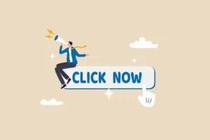
CTA Call to Action Imagine you’re watching a movie. The hero looks right at the camera, holds out their hand, and says, “Come with me.” You feel pulled in. That’s a Call to Action.
In the business world, a Call to Action (CTA) is exactly that—a direct prompt that tells your audience exactly what you want them to do next. It’s your website’s, email’s, or ad’s “Ask Button.”
It can be a button, a link, a line of text, or an image that says things like:
-
“Buy Now”
-
“Sign Up Free”
-
“Download the Guide”
-
“Learn More”
-
“Get Started”
-
“Contact Us”
If your content (a blog post, an ad, a social media post) is the friendly conversation, the CTA is the point of the conversation. It’s where you ask for the next step. Without it, your audience might enjoy the chat, but then just walk away, unsure of what to do. A CTA removes that confusion.
Chapter 1: Why Are CTAs So Important? The Bridge Analogy
Think of your customer’s journey like crossing a river.
-
One side of the river is where they first discover you (they see your ad, find your blog).
-
The other side is where they become a happy customer (they buy your product, join your service).
Your marketing builds the bridge. Your content—helpful blogs, fun videos, informative product pages—are the planks and railings of that bridge.
The CTA is the sign that says, “Step This Way to Cross.” Without clear signs, people might wander onto the bridge, enjoy the view, but never actually make it to the other side. They get distracted and leave.
A strong CTA does three critical jobs:
-
It Guides the User: It cuts through confusion. Instead of a visitor thinking, “This is interesting… now what?” the CTA tells them, “Click here for the next interesting thing.”
-
It Creates Movement: It moves people from being passive viewers to active participants. A click is a small commitment, a “yes” to engaging a little deeper.
-
It Measures Success: When someone clicks your “Sign Up” CTA, you know your marketing is working. CTA clicks are one of the clearest ways to measure if people are responding to your message.
In short: No CTA, no clear path. No clear path, no customers.
Chapter 2: The Anatomy of a Powerful CTA (It’s More Than Just Words)
A good CTA isn’t just the text. It’s a little package of persuasion. Let’s break down what makes a CTA button irresistible.
1. The Words (The Copy):
The text on the button is the most important part. It should be:
-
Action-Oriented: Start with a strong verb (Get, Start, Download, Join, Build, Claim).
-
Clear & Specific: Say exactly what will happen. “Download Your Free E-book” is better than “Click Here.”
-
Value-Focused: Answer the user’s silent question: “What’s in it for me?” “Get My Free Plan” highlights the benefit (a free plan) better than just “Subscribe.”
-
Urgent or Scarcity-Driven (Sometimes): Words like “Now,” “Today,” or “Limited Spots” can encourage immediate action.

2. The Design (The Look):
The button needs to be seen to be clicked.
-
Color: It should be a bold, contrasting color that stands out from the rest of the page. If your website is blue and white, an orange or green CTA button will pop.
-
Size: It should be big enough to notice, but not so big it’s obnoxious.
-
Whitespace: There should be clear space around the button so it doesn’t look crowded.
3. The Placement (The Location):
Even the best button won’t work if it’s hidden.
-
“Above the Fold”: This old newspaper term means the part of the webpage you see without scrolling. Your main CTA should often be here.
-
Natural Flow: Place CTAs where they make sense. At the end of a blog post explaining “10 Gardening Tips,” a CTA for “Download Our Full Gardening Guide” makes perfect sense.
-
Multiple Times: On a long page (like a product page), it’s okay to have the same CTA (e.g., “Add to Cart”) in a few places so the user never has to scroll far to find it.
Chapter 3: Types of CTAs for Different Goals (The Right Ask for the Right Stage)
You wouldn’t ask someone to marry you on a first date. Similarly, you need different CTAs for people at different stages of knowing you.
-
Top-of-Funnel CTAs (For Strangers):
-
Goal: Capture interest and get contact info (usually an email address).
-
User Mindset: “I don’t know you yet, but I’m interested in this topic.”
-
Soft Ask Examples: “Subscribe to Our Newsletter,” “Download the Free Checklist,” “Watch a Free Webinar,” “Get the Whitepaper.”
-
These offer value first, in exchange for a low-commitment action.
-
-
Middle-of-Funnel CTAs (For Interested Friends):
-
Goal: Nurture the relationship and build trust.
-
User Mindset: “I like your free content. Tell me more about your paid solution.”
-
Medium Ask Examples: “Register for a Demo,” “Start a Free Trial,” “Compare Pricing Plans,” “Read Case Studies.”
-
These help the user evaluate you before buying.
-
-
Bottom-of-Funnel CTAs (For Ready-to-Buy Customers):
-
Goal: Make the sale.
-
User Mindset: “I’m convinced. I’m ready to buy.”
-
Direct Ask Examples: “Buy Now,” “Add to Cart,” “Purchase License,” “Get Started” (on a pricing page), “Contact Sales.”
-
These are the final, direct asks to complete the transaction.CTA Call to Action
-
Real-World Example: A Software Company
-
Blog Post (Top): “5 Ways to Improve Team Productivity.” CTA at the end: “Download the Full Productivity Playbook” (asks for email).
-
Landing Page for Playbook (Middle): After download, the thank-you page says: “See the tools in action! Start a 14-Day Free Trial.”
-
Trial Dashboard (Bottom): As the trial ends, buttons appear: “Upgrade to Pro Plan” or “Talk to an Expert.”
Each CTA is a logical next step, guiding the stranger gently toward becoming a customer.CCTA Call to ActionTA Call to Action
Chapter 4: Common CTA Mistakes Beginners Make (And How to Fix Them)
-
The Vague CTA: “Click Here”
-
Why it’s bad: It gives no reason to click. What will I get? What will happen?CTCTA Call to ActionA Call to Action
-
The Fix: Be specific. Change “Click Here” to “Download Your Free Template” or “Read the Customer Story.”
-
-
The Overwhelming CTA: Too Many Buttons
-
Why it’s bad: If you have 5 different buttons saying “Buy,” “Learn,” “Sign Up,” “Contact,” “Watch,” the user gets confused and does nothing. This is “choice paralysis.”CTCTA Call to ActionA Call to Action
-
The Fix: Have ONE primary CTA per page or section. Make it the clearest, most important action. Use a less prominent color or style for secondary actions.CTA Call to Action
-
-
The Invisible CTA: Blending Into the Background
-
Why it’s bad: If your “Buy Now” button is the same color and size as the rest of your text, no one will see it.
-
The Fix: Use contrast! A bold, complementary color that stands out visually from your page’s color scheme.
-
-
The Broken Promise CTACTA Call to Action
-
Why it’s bad: Your CTA says “Get the Free Course,” but the link goes to your general homepage where the user has to search for it. This breaks trust.CTA Call to Action
-
The Fix: ALWAYS link your CTA directly to a page that delivers exactly what the CTA promised. “Get the Free Course” should go straight to the course sign-up page.CCTA Call to ActionTA Call to Action
-
Chapter 5: How to Test and Improve Your CTAs (The Never-Ending Game)
The best marketers don’t just guess what works; they test. This is called A/B Testing (or Split Testing).
It’s simple: You create two versions of a CTA (Version A and Version B) that are identical except for ONE change. You show each version to 50% of your visitors and see which one gets more clicks.CTCTA Call to ActionA Call to Action
What can you test?
-
Text: “Start Free Trial” vs. “Get Started for Free”
-
Color: A green button vs. a red button
-
Size: A large button vs. a medium button
-
Placement: A button at the top of the page vs. in the middle
The winner is the one with the higher click-through rate (CTR). You then use the winner as your new standard, and start testing something else! Small improvements in your CTA can lead to big increases in customers.CTA Call to Action
Conclusion: Your CTA is Your InvitationCTA Call to Action
Think of your business as a host at a party. Your marketing is the music, food, and decorations that make people come in. But once they’re in, you need to welcome them, start a conversation, and invite them to join the fun.CTA Call to Action
Your Call to Action is that invitation. It’s the clear, friendly, exciting “ask” that moves people from just looking to actually participating.CTA Call to Action
So, on every page, in every email, ask yourself: “What is the ONE thing I want this person to do right now?” Then, make that action unmissable, clear, and easy. Craft your CTA with care, test it, and watch as more and more people accept your invitation to become customers.CTA Call to Action
Now that you know what a CTA is… what’s the next step you want your reader to take?CTA Call to Action


